Advocacy, Mentorship, Perspectives, Learning, Inclusion, Fairness and You. An initiative to make all employees feel accepted and heard.
AMPLIFY
Scroll ↓
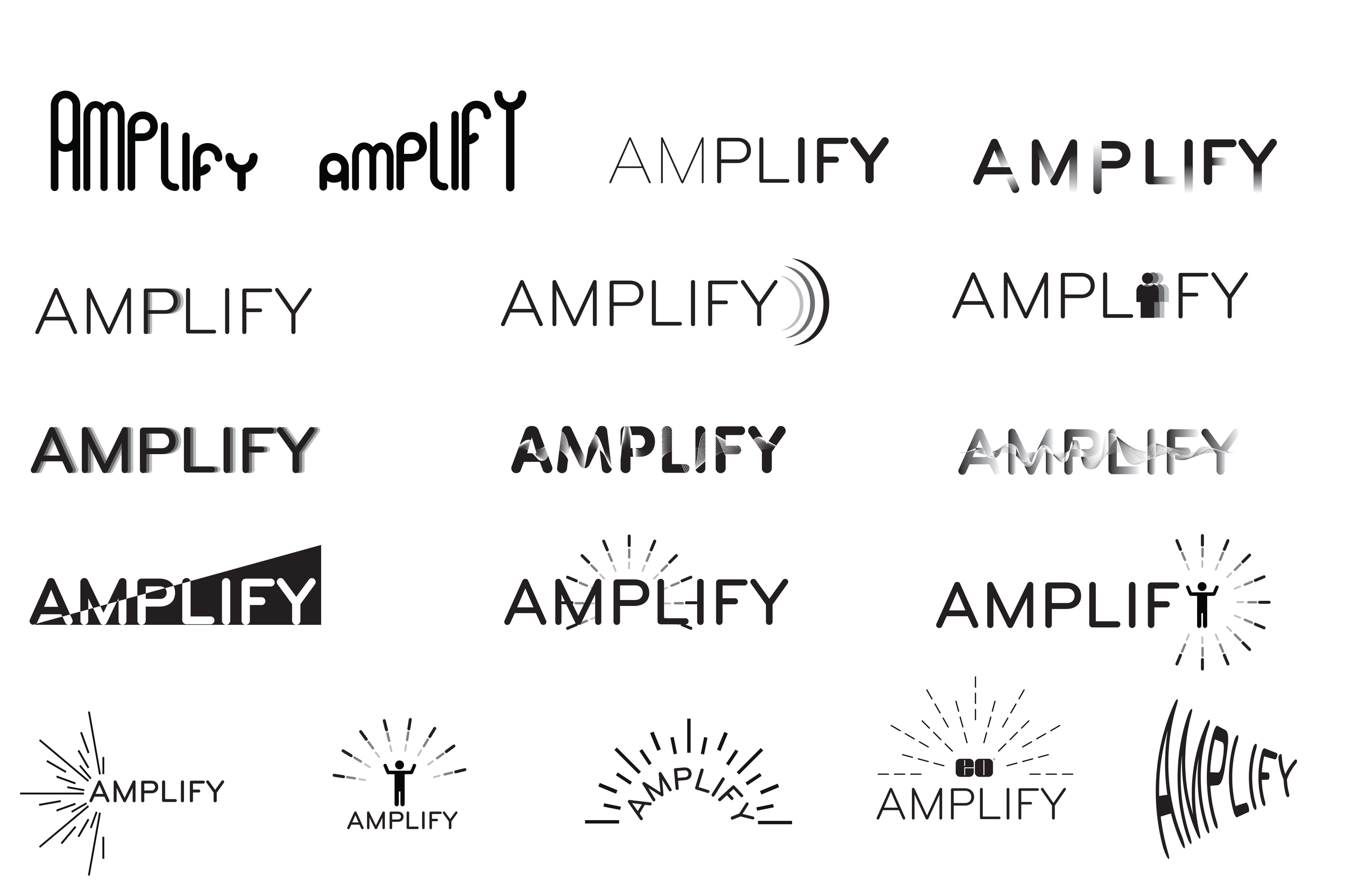
Logo sketching began exploring the word “Amplify,” meaning to increase the volume of something or enlarge it. The idea of sound waves, differences in scale, and “bursts” came into play.
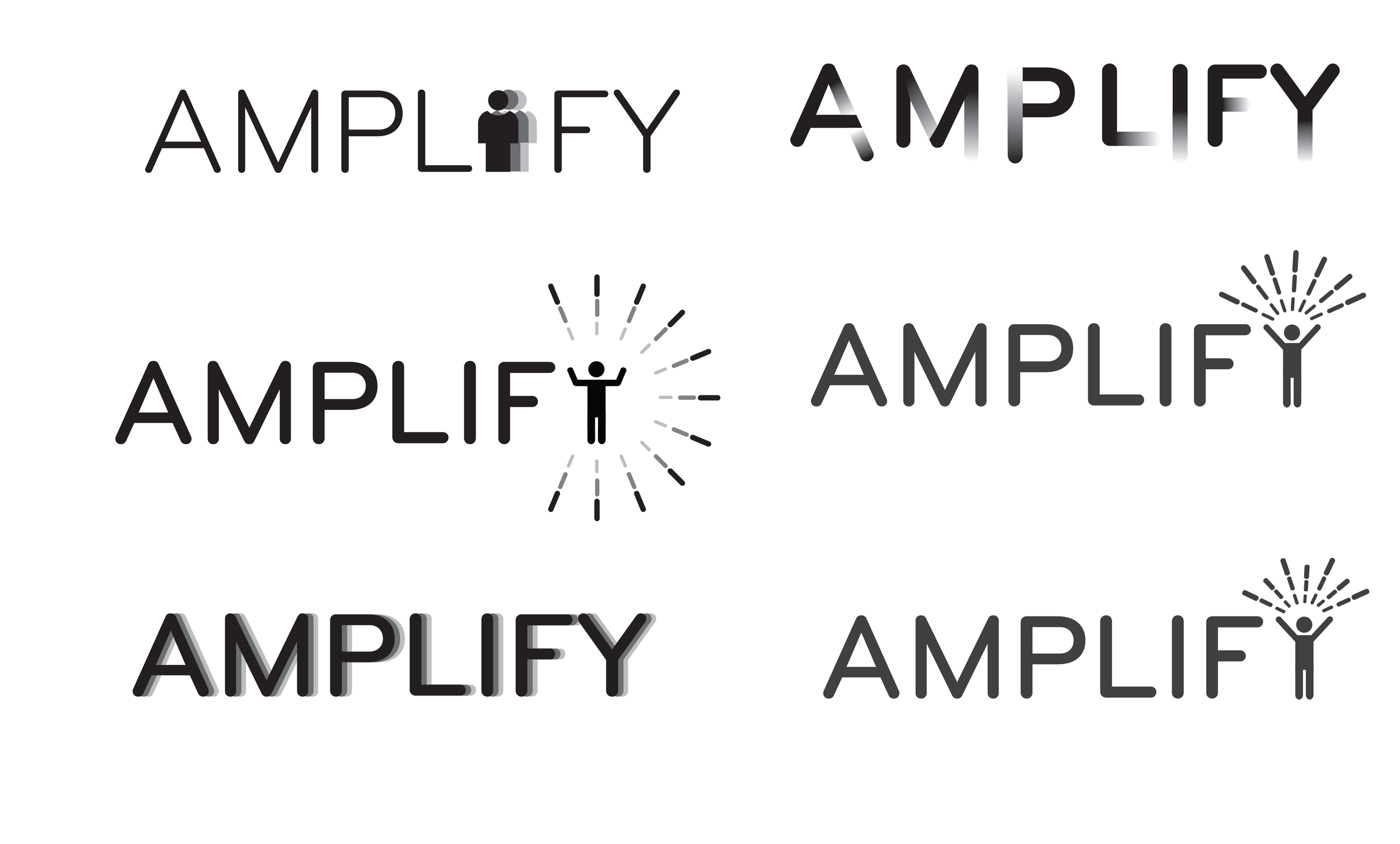
As it became more refined, the AMPLIFY logo became more people centric. At it’s base, this initiative is cenetred around the well-being and inclusion of people.
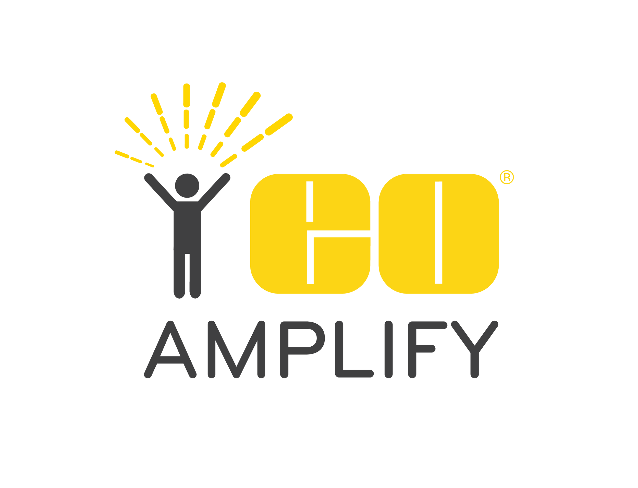
The final design is a stacked logo with pictorial and wordmark attributes. The horizontal version is used when necessary.
This logo utilizes the Edmund Optics yellow and another color commonly used in our designs, a dark gray. “AMPLIFY” is in a rounded, san-serif font that both fits the corporate environment and appears welcoming. The person has their arms open and raised in an expressive posture with a burst made of seven lines (one for each aspect of AMPLIFY). This logo is used in all official AMPLIFY communications, webpages and activity promotions.
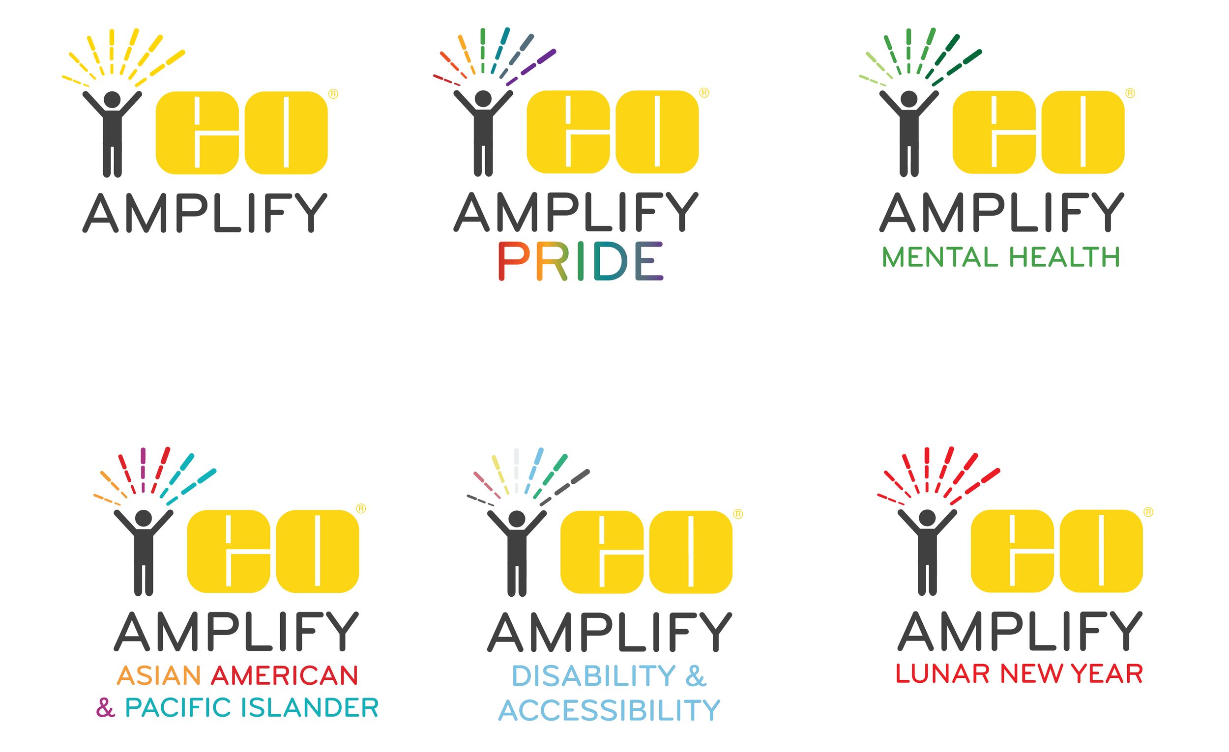
A few examples of how the AMPLIFY logo could be used to promote awareness of various cultures and advocate for disadvantaged groups.