A quick, snappy, digestible way to learn about Optics!
Byte Size
Scroll ↓
Byte Size was created to be a quick, snappy digestible way to learn about optics. Written and acted by one of Edmund Optics’ engineers, it takes concepts such as Depth of Field, Chromacity and Color vs. Monochrome and puts the finer details of the science behind it all into terms everyone can understand. When approached by the video team of Edmund Optics to create the Byte Size logo and episode animations, I was excited at the prospect of helping to create something so unique and fun.
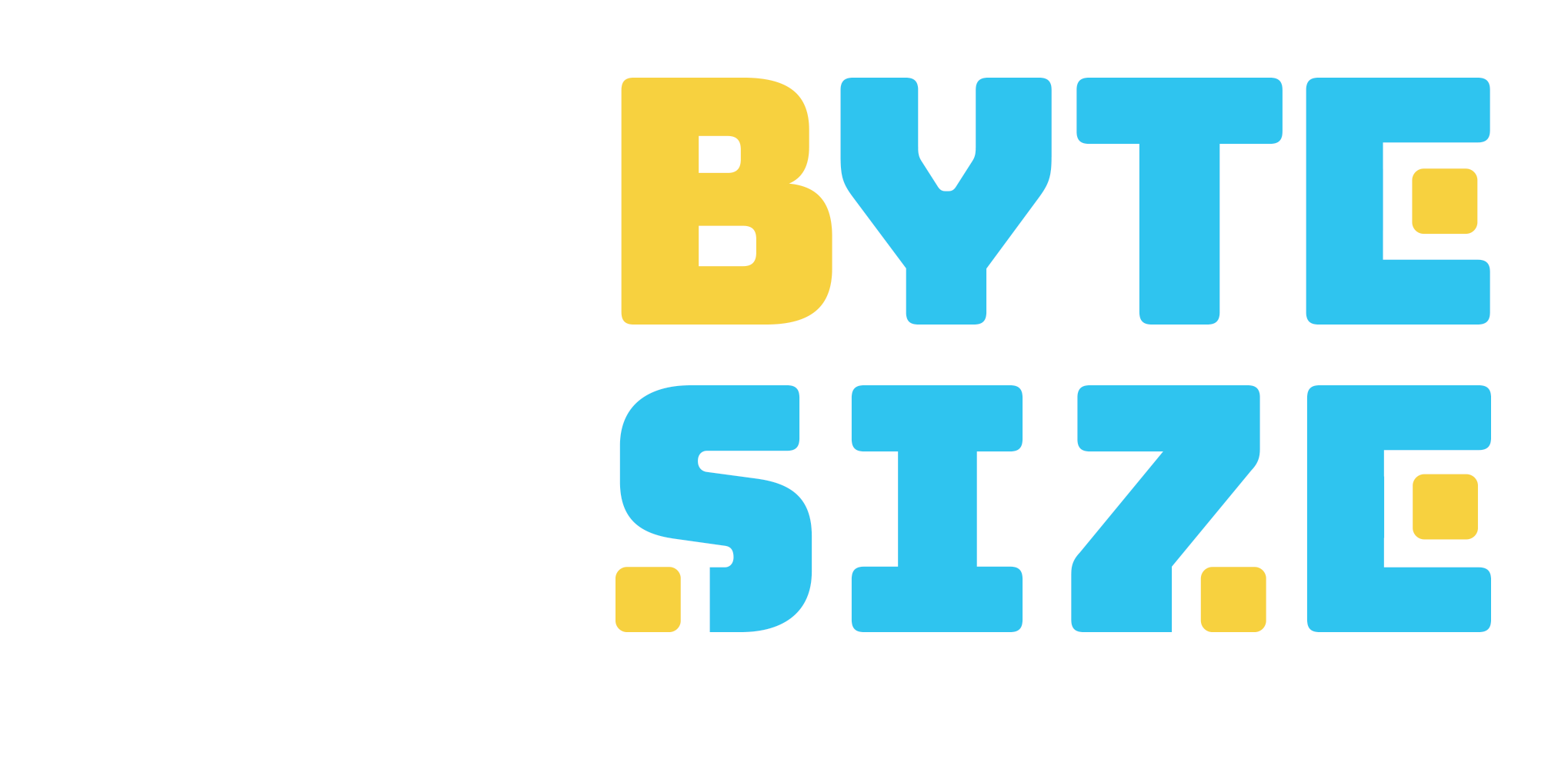
After having settled on blue and yellow as my colors (blue, typically used in the sciences and yellow, inspired by the main color of the Edmund Optics Logo), the logo design began. Because of the word “Byte” I wanted to go with a design that was reminiscent of eight bit computer graphics…think old school video games.
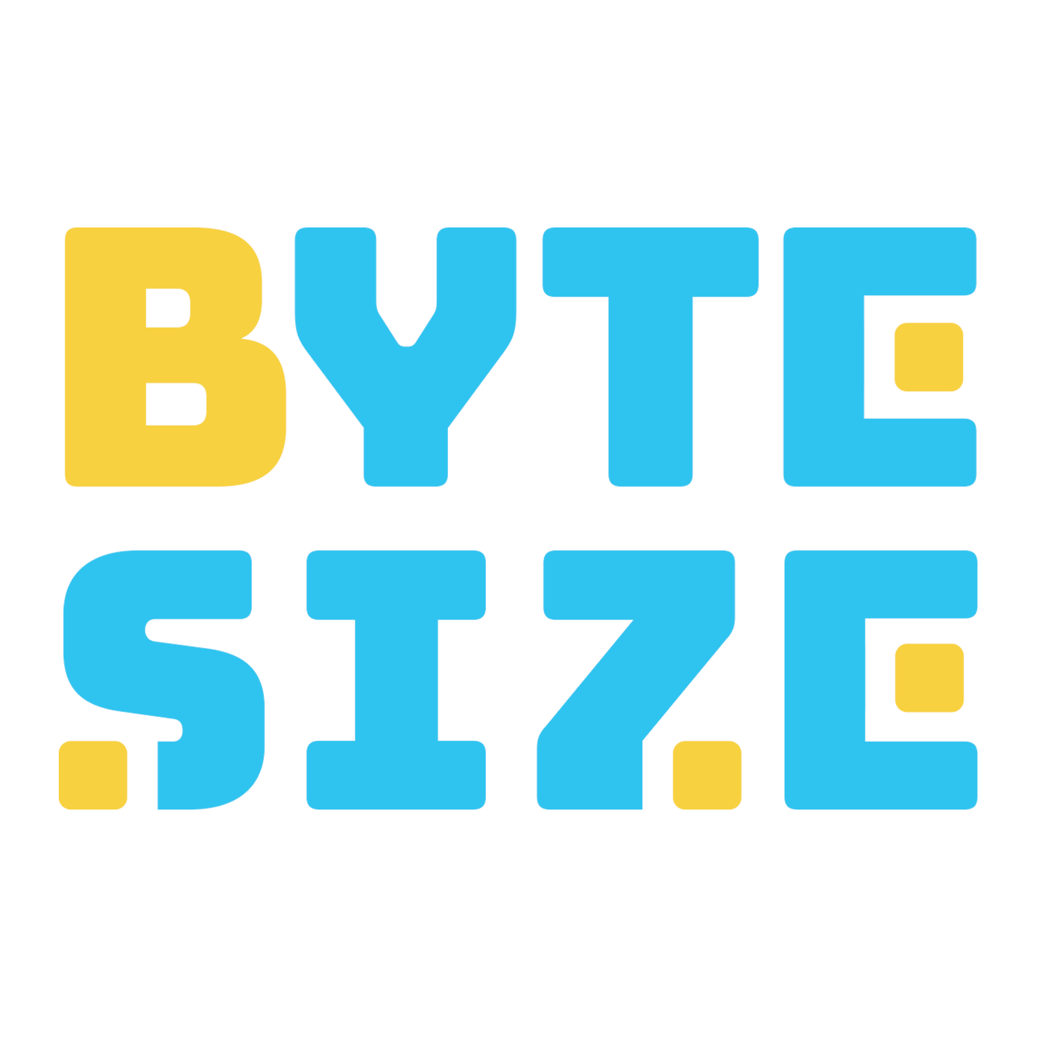
The final logo came together as a curvy, bold wordmark. The look of eight bit computer graphics is not front and center, but present in the form of the cubes being used to form the ends of letters (sharp, pixelized squares seemed too harsh and uninviting).
The Byte Size logo animation, made in After Effects, is both fun and professional. Starting with the full logo, each individual letter merges to become the blue background square, while the yellow squares go on to form the pattern of yellow squares of the logo mark.

An opening sequence animation for an episode of Byte Size about depth of field. This particular opening sequence was crafted using the themes of an older horror movie.

A few examples of animated arrows and circles made for emphasizing details in Byte Size. The circles are in a variety of colors and sizes, depending on the background they are needed on, and the arrows were made to be pixelated to further the eight bit look in the overall branding.
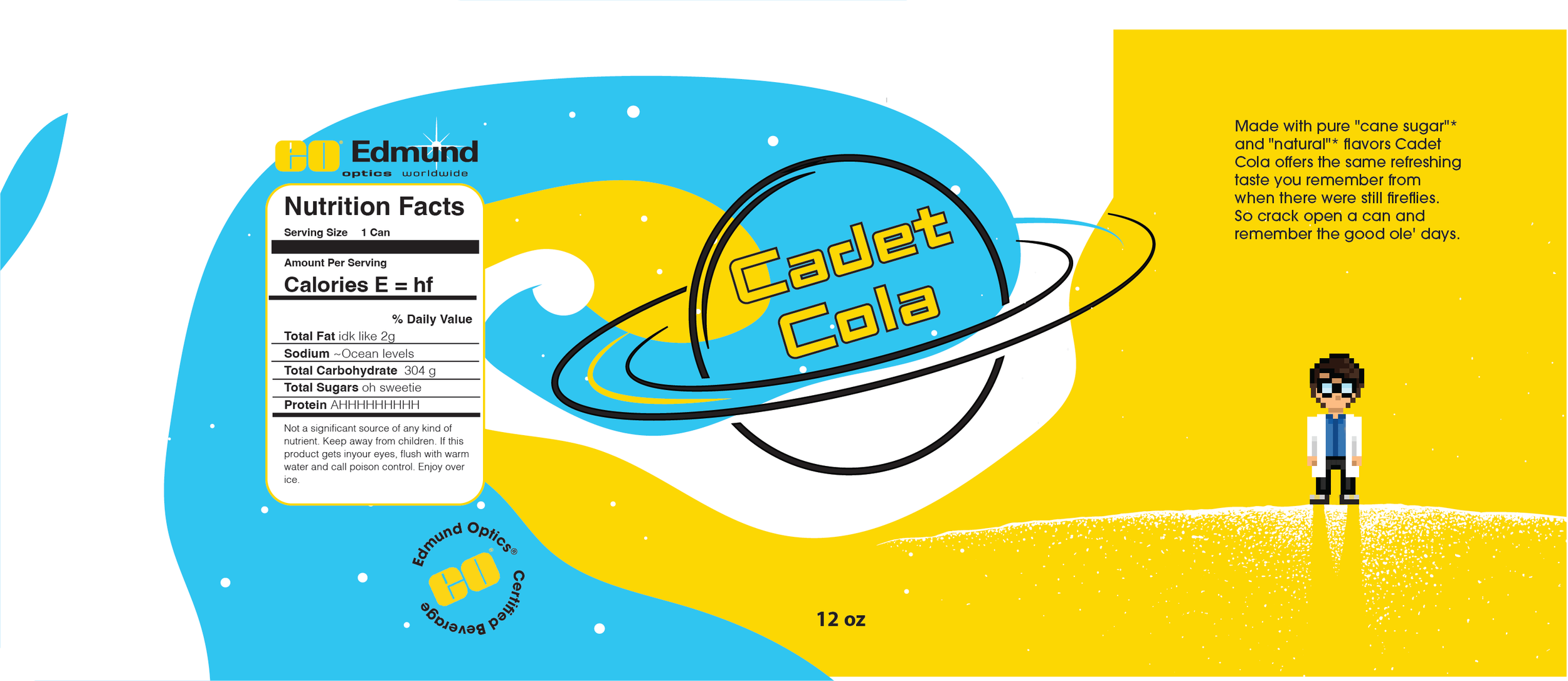
The soda can wrapper made for Cadet Cola, a space-themed, silly soda made for an episode of Byte Size. Featured is a pixelated version of Byte Size’s host, Chris, along with a fake nutritional value and official Edmund Optics Branding. The color palette holds the same blue and yellow as the Byte Size logo.